For the first time, a blending of two colours has been chosen as Colour Of The Year 2016 by PANTONE. The dazzling combination is Rose Quartz & Serenity (PANTONE 13-1520 & PANTONE 15-3919).
The two shades are pairing to express feelings related to mindfulness & well-being: calm, relaxation, reassurance, security, order and peace. This echoes the consumer's need for a serene and relaxing escape from the frenetic aspects of modern life.
A spokesperson for Pantone said: "Rose Quartz is a persuasive yet gentle tone that conveys compassion and a sense of composure. Serenity is weightless and airy, like the expanse of the blue sky above us, bringing feelings of respite and relaxation even in turbulent times."
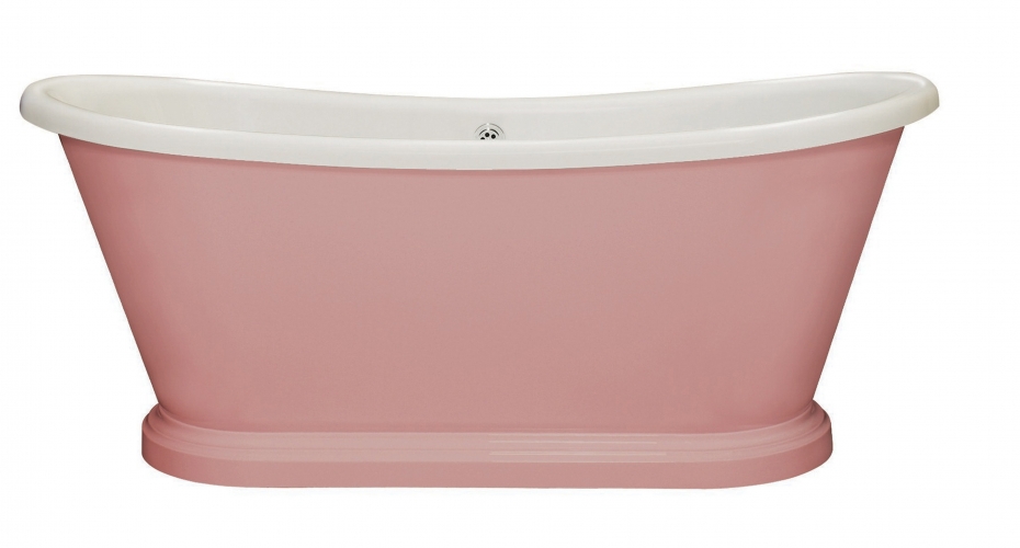
There are many ways you can bring this serene colour combination into your home. How about this beautiful bath for starters? It could work exceptionally well in a more neutrally decorated bathroom."
Photo: Pink Painted Acrylic Boat Bath BC Designs, BC Designs (www.bcdesigns.co.uk)